jooky: pictures

some pictures of jooky in action are here. also you can see my current setup.

pictures
bisky
here is a top-down image of my jukebox machine, bisky. it is spilled out with its guts placed all around my desk, but it is keen for development.
main menu
this is the initial jooky menu. from here, all things are possible! in the next few pictures, the basic 'menu-driven' interface of jooky is described. you navigate by either clicking right, going up or down, or clicking back to the previous menu. the cursor (small triangle at left) indicates where you are in the menu. the arrows at right indicate if there is content above or below -- like a standard scrollbar.
more of the main menu
this shows the same main menu, scrolled down a little. you can see how the cursor behaves a little more; it's quite intuitive, much like cell phone menus and other scrolling things. also note the presence of the 'up' scroll arrow; this is a hint to you that there are some options available if you scroll back up.
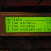
artists submenu
you can browse your music in a number of fashions; this is what happens when you click "artists" on the main screen. i've got quite a lot of artists to choose from; here i have scrolled down quite a ways because i wanted to listen to the streets. clicking right will show you each album for that artist (next picture). note presence of the "<" at the top right; this is another UI hint that you can press the back button to go back to the previous menu (in this case, it's the main menu.)
artist's albums submenu
once you click on an artist, you'll get a menu of all of that artist's albums known to jooky. in my case, i only have one album by the streets. it's actually called original pirate material; long names scroll automatically. when you're in a menu, though, only the item where the cursor is gets to scroll. this makes thing less distracting; only the title that you're interested in will scroll.
album's tracks
now, we go one level deeper in the music heirarchy, looking at the tracks belonging to a particular album of a particular artist. tracks are listed in album order, and a special item (play all) is available at the top. clicking on a track in jooky will enqueue it, not replace the current track (as is the case with an ipod). thus, you can happily browse and add tracks without disrupting the current songs, building a playlist as you go.
playback
here is how jooky looks currently (apr 20003) when it is playing some music. the progress bar (on line three) is made with custom icons in the matrix-orbital ram, as are the cd and music-note icons. note that long names are scrolled by the software, with proper delay for readability. the artist name is shown in the next image.
playback details
this is an older picture, and it looks a bit strange, but it shows the artist name when playing back. the artist name and the album name share the same line in the current UI.
bisky on desk
another shot of the development setup. (also reveals very old bug with long playlist wrapping..)

site & code © 2003 mike wakerly
project page: http://jooky.souceforge.net/